
| 일 | 월 | 화 | 수 | 목 | 금 | 토 |
|---|---|---|---|---|---|---|
| 1 | 2 | 3 | 4 | |||
| 5 | 6 | 7 | 8 | 9 | 10 | 11 |
| 12 | 13 | 14 | 15 | 16 | 17 | 18 |
| 19 | 20 | 21 | 22 | 23 | 24 | 25 |
| 26 | 27 | 28 | 29 | 30 | 31 |
- 앨범북
- SwiftUI
- fido
- 안드로이드
- 인증
- 2FA
- OSX
- kmip
- 애플
- Android
- MYSQL
- albumbook
- OTP
- FIDO2
- git
- css
- appres
- SSL
- WebAuthn
- MFA
- SWIFT
- openssl
- otpkey
- apple
- 앱리소스
- 앱스토어
- Nodejs
- SSH
- MSYS2
- Xcode
- Today
- Total
인디노트
Smoothing out <div> scrolling in Mobile WebKit Browsers 본문
Smoothing out <div> scrolling in Mobile WebKit Browsers
인디개발자 2016. 9. 14. 10:51가져온 글 :
출처 https://weblog.west-wind.com/posts/2013/jun/01/smoothing-out-div-scrolling-in-mobile-webkit-browsers
One thing that is annoying in WebKit mobile browsers - and especially on iOS mobile browsers - is the default scroll behavior for HTML elements that have text overflow. Unlike desktop browsers which easily scroll content, many mobile browsers by default have a terrible experience scrolling <div> tags that have overflow-y: scroll or auto when there's more than a few elements of overflow.
Instead of smooth, elastic scrolling the default scrolling provides only a slow and often stuttering behavior. If the list gets large or the layout for each item is complex the list may get so slow it appears to lock up altogether or jump unpredictably.
Luckily there's an easy workaround for this behavior via a WebKit specific override style that enables a better touch based browsing experience:
<div style="-webkit-overflow-scrolling: touch;">
Applying this style makes a difference of night and day providing elastic and accelerometer based scrolling behavior that you would expect - the harder you press and the faster you swipe the further the scrolling goes. Scrolling is smooth and there's no stuttering even for fairly large lists. Hey that’s the way it’s supposed to work in the first place.
Primarily an iOS Issue
This issue primarily concerns iOS devices like iPhone, iPod Touch and iPad. While the iOS devices browser level scrollbars are super smooth, actual <div> tags are terribly and stuttering. From comments it appears that many Android devices have this scroll behavior turned on by default, so this tweak only applies to iOS devices and older Android devices. I'd be curious to hear what devices outside of iOS have scroll issues that are fixed by using -webkit-overflow-scrolling tuning when you try the sample form and compare the two lists it displays.
To demonstrate here's a small sample form that shows a slow list with default scrolling and one that's optimized below it:
http://www.west-wind.com/WestwindWebToolkit/samples/Ajax/html5andCss3/WebkitOverflowScroll.aspx
The page has two lists with the same data. In this example, I generate some repetitive list data in JavaScript and then render the data into a list using handlebars.js (you can look at the self contained source in browser). Here's what the desktop and mobile views of the sample look like:

To see the problem though you'll have to access the page on a mobile device. You can scan the QR code on the sample page, or the one below here (I use QRReader for iOS, or on Android) to bring up the page on your phone without typing out the long URL:
On the mobile page you'll have to use the Slow Box/Fast Box links to switch between the slow and fast fast scrolling boxes.
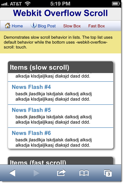
The list on the top uses default scrolling and while it works it scrolls slowly and has none of the swipe scrolling features, but rather moves exactly as far as you move your finger. While that works, it's not the scroll behavior you want to see on a mobile device - we've become spoiled by smooth accelerator based scrolling that responds to the vigor of your swipe.
The second list adds the -webkit-overflow-scrolling: touch; behavior. It contains the same data as the first, but it scrolls smoothly using the accelerometer feature's strength of the swipe to determine how far to scroll. Putting your finger down stops the scrolling. IOW it behaves the way you'd expect it to on a mobile device.
Gotchas
While playing around with this originally, trying to get scrolling to work for a rather large list I actually found that applying the style using a CSS class didn’t work. I had the style attached as part of my style sheet like so:
.msglistbody
{
    font-size: smaller;
    overflow-y: scroll;
    -webkit-overflow-scrolling: touch;
}
However, when I ran the form I still found the stuttering to hamper vertical movement of this list of about 50-80 items. Oddly when I would look at Chrome’s DevTools it would clearly show that the tag was applied both in the actual active CSS styles as well as in the actual applied styles, but no smooth scrolling on iOS.
I found it would only work in one of two ways:
- Applying directly on the attribute:
<div id="PostList" class="msglistbody" style="-webkit-overflow-scrolling: touch;">
- Or applying via script:
$("#PostList").css({
    "overflow-y": "auto",
    "-webkit-overflow-scrolling": "touch"
});
Now, I’m not quite sure why this was required in this particular application, but it wouldn’t work with class styling. To be sure though in other apps class level styling seems to work just fine. This is just one of those gotchas – if it doesn’t work for you this might be something to try.
Note that popular CSS frameworks automatically apply this styling. For example bootstrap.css applies it like this:
@media (max-width: 767px) {
  .table-responsive {
    width: 100%;
    margin-bottom: 15px;
    overflow-y: hidden;
    overflow-x: scroll;
    -ms-overflow-style: -ms-autohiding-scrollbar;
    border: 1px solid #dddddd;
    -webkit-overflow-scrolling: touch;
  }
Oddly Bootstrap only applies this to sub-tablet sizes (max-width under 767px) so this wouldn’t actually do anything for tablets, which is yet another reason you might have to fiddle with this style even if you use Bootstrap.
Why isn't this the default Behavior on Mobile WebKit?
As it turns out -webkit-overflow-scrolling is not without its own set of problems.
The feature uses native scrolling behavior that like CSS transitions can tax the mobile GPU quite heavily resulting in heavy battery usage. So by default this behavior is not enabled. If your lists are barely overflowing or use overflow only for the odd case where some minor amount of text might overflow, using the default behavior is just fine. There's no reason to have super fast scrolling in those scenarios. Native overflow only makes sense when you explicitly built content that is meant to scroll like the list in the example.
There are also a handful of known issues related to contained content that uses non-static positioning. If you have position: relative; or absolute; content inside of the scrolling region in some instances the relative content doesn't scroll with the rest of the document resulting in a badly misrendered list.
For me personally I've not had a problem with this however, as I tend to create fairly simple lists for scrolling. I think in typical vertical scrolling scenarios like lists the position issue isn't typically a problem. However, if you're building a touch based carousel or horizontal slider type interface, position can be more of an issue as you're often dealing with more complex content in these slide tile like interfaces.
Tricky, Tricky
I didn't know about this little trick until last week and I ran into it by accident. I was lamenting about some unrelated scroll issues on Bob Yexley (@ryexley) on Twitter jumped in with the -webkit-overflow-scrolling style attribute.
The difference this tweak has made on several of my Web apps however, was tremendous. In particular one app that is a local classifieds listing app that uses incremental loading for large numbers of listings, was very painful to use once more than 50 or so items where loaded incrementally with scrolling. In fact, due to the bad scroll performance we limited the list to 50 entries on mobile devices. Now with the improved scroll performance, we've removed the restriction and we can actually manage the list and the current view size by removing items that aren't shown any longer all without losing scroll performance which is awesome. Several other apps could use this as a drop in replacement and also see drastically improved scrolling for some of the app's lists.
It's frustrating however, that there are browser specific tweaks like this. I consider myself reasonably aware of HTML and CSS changes as they come online but this one's escaped me for nearly two years. It was pure accident that made me find this one. Keeping up with browser dependent tweaks like this is not trivial and in this case it was by accident that I landed at finding it.
Nevertheless I'm excited to see this addressed - it's made a couple of internal apps I'm using daily way more usable. Chalk that one up as a winner…
'소스 팁 > HTML, Java Script, jQuery, CSS' 카테고리의 다른 글
| Javascript - 비밀번호 유효성 검사 (0) | 2017.04.02 |
|---|---|
| CSS: 선택자(Selector) 이해 (0) | 2017.02.16 |
| CSS 제대로 쓰기 (0) | 2017.02.16 |
| CSS3 @media query를 이용하여 반응형 웹 스크린 크기 대응하기 (0) | 2016.09.14 |
| DIV 모바일 웹에서 스크롤 속도 늦고 부자연 스러움 (0) | 2016.09.14 |